Delicate Weaves crafts premium handmade rattan planters for the Russian market. The products
were exceptional. The website was not.
Brand
Delicate Weaves Premium rattan planters & baskets
Role
UX/UI Designer Solo project - research to coded implementation
Problem
Generic light design invisible online. No hierarchy, no brand story, no
trust.
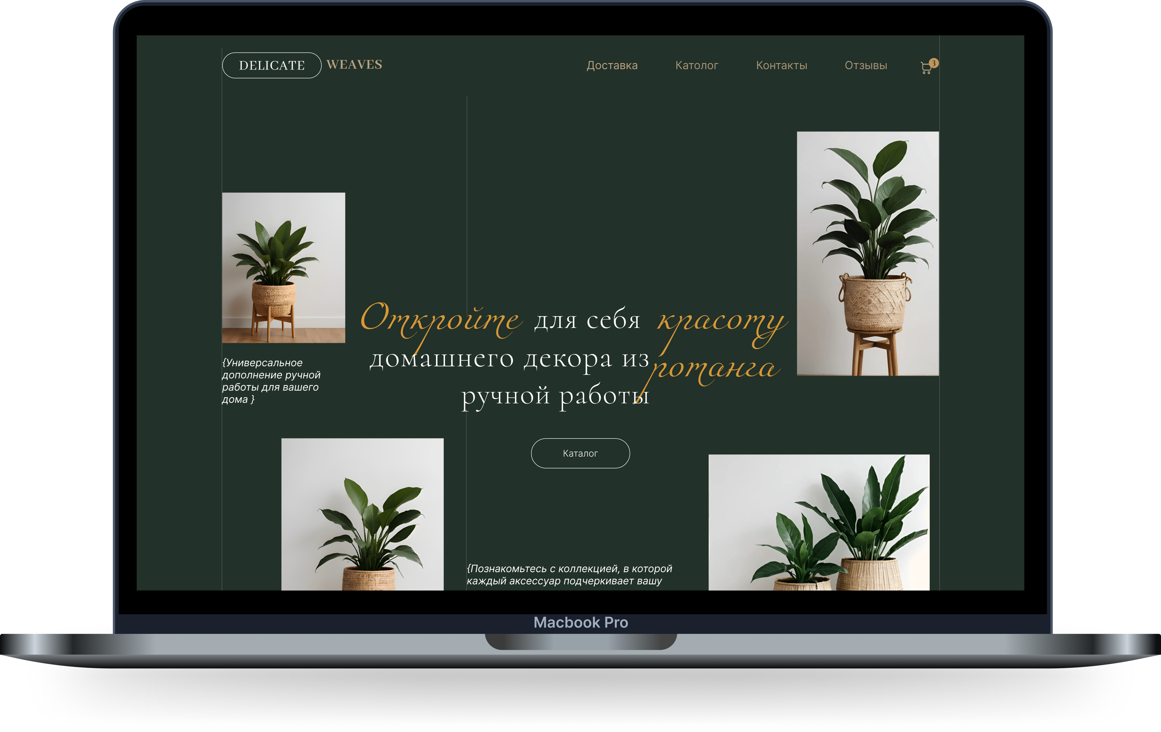
Solution
Premium editorial redesign. Dark palette · asymmetric grid · full
responsive
Deliverables
Figma prototype · HTML/CSS build User research · CJM · User Flow
Market
Russia · E-commerce Telegram / WhatsApp conversion model
1
Discovery & Audit
2
Research & Personas
3
User Flow & CJM
4
Visual Design
5
Prototype & Refine
6
HTML/CSS Dev
02 - The Challenge
Premium products. Average digital presence.
72% of traffic arrived on mobile. The bounce rate was high. Users couldn't distinguish one
product from another. The brand's artisanal identity was completely invisible.
0%
of catalogue page visitors left without clicking a product - unclear categories and no
product context drove high drop-off
68%
drop-off
0%
of all traffic arrived via mobile - yet the original site had zero responsive design,
creating broken layouts and unreadable text
72%
mobile
0s
average time before users decided to leave - the first impression was the only
impression, and the original design failed to make it count
3s
decide
0×
price point of premium competitors - users couldn't justify the cost because the brand
failed to communicate the value of handcraft
2×
premium
03 - Research & Personas
Understanding the buyer.
Two primary buyer types emerged from heuristic analysis and competitive review. Each needed
a fundamentally different reassurance from the brand.
Persona A
Anna, 32
Interior Stylist · Moscow · Mobile-first
Primary goalFind pieces that
photograph well for clients
TriggerClient project requires natural
materials
Biggest concern"Does this look premium
in a real interior?"
Decision factorLifestyle photography,
not product photos
Pain points with original site
Only white-background photos - no interior context
No differentiation between similar products
Mobile layout was completely broken
"I need to see the basket in a room, not on a white table. How else do I know if it fits my client's
aesthetic?"
- Persona A · Composite voice
Persona B
Maria, 45
Homeowner · Saint Petersburg · Desktop buyer
Primary goalFind a quality planter
worth 5,000₽+
TriggerSaw brand on OZON, visiting
site directly
Biggest concern"Can I trust this brand
with a large purchase?"
Footer with social links, newsletter invite, and related products section
06 - Design Audit
Before: what the original site communicated.
An honest audit of the original Delicate Weaves site identified five structural
problems - each of which actively undermined the brand's premium positioning.
BEFORE
Decorative elephant diverts attention from products - no connection to rattan brand
Identical-looking product cards with no size info, no context, no differentiation
White background feels like any generic marketplace - zero premium signal
Five Critical Issues
01
Visual Identity - Light colours and scattered accents
communicated nothing about the brand's premium, handcrafted nature. The site looked identical to any
generic online shop.
02
Information Architecture - No logical path from homepage to
purchase. Catalogue categories were ambiguous. Users couldn't make informed decisions.
03
Product Presentation - Every product was shown on a white
background, stripped of all context. Users couldn't visualise the item in their own space.
04
Typography & Hierarchy - A single font weight throughout meant
nothing stood out. No visual cues to guide the reader's eye toward a call to action.
05
Mobile Responsiveness - No responsive design whatsoever. 72% of
traffic experienced broken layouts and unreadable text - the primary audience was unreachable.
07 - Colour System
A palette rooted in material.
Forest Depth
#223129
Primary Background
Warm Gold
#C8892A
Accent · Highlight
Rattan Sand
#B8A080
Navigation · Labels
Clean Linen
#F5F0E8
Light Sections
Sage Line
#7A8A72
Borders · Muted Text
Primary UI
Forest Depth as base, gold as the sole accent. Used across all dark sections,
navigation, and the hero.
Muted Layer
Rattan sand for navigation labels. Sage for borders, dividers, and secondary copy -
never competing with gold.
Light Sections
Linen cream for research, user flow, and layout sections - giving the eye contrast
relief from the deep greens.
Deep forest green - creates an immersive, gallery-like atmosphere. Signals exclusivity
without a single word. References the natural origins of rattan.
Warm gold - drawn from the natural colour of rattan fibre and aged brass. Used sparingly
as an accent for maximum visual impact and luxury association.
Rattan sand - a bridge tone that references the raw material. Appears in navigation and
interface labels to maintain material continuity across the UI.
08 - Typography System
Three voices, one story.
Cormorant
Cormorant Garamond
Primary - Headings & Nav
Light 300 · Regular 400 · SemiBold 600
High-contrast serif with literary character. Communicates heritage, craft, and
sophistication - exactly what the brand needed.
Miama Nueva
Miama Nueva
Decorative - Key Moments Only
Regular Script
Flowing script referencing handwriting and craft. Reserved for hero moments,
delivery headlines, and emotional accent words.
Inter
Inter
Functional - Body & UI
Light 300 · Regular 400 · Medium 500
Neutral and highly legible. Grounds the luxury aesthetic in practical clarity -
ensuring usability is never sacrificed for aesthetics.
Display
- Cormorant Garamond Light Italic
HEADING
- CORMORANT SEMIBOLD · TRACKED
Body copy
- Inter Light 300 · 18px · 1.75 line height · comfortable for long-form reading
LABEL
- INTER 600 · 3.5PX TRACKING · UPPERCASE · USED FOR SECTION MARKERS
09 - Layout & Grid
Breaking the symmetry.
Instead of the original site's static, equal-column structure, the redesign uses
an asymmetric editorial grid - borrowed from luxury print design - that creates visual rhythm and surprise
across every page.
Products shown inside white-framed photographs act as windows into refined
interiors. The frames reference gallery display, elevating product perception without changing the product
itself.
01
Asymmetry creates movement and guides the eye across the page without explicit
navigation cues
02
White gallery framing around photographs elevates perceived product value and signals
premium quality
03
Generous negative space signals confidence - the brand has nothing to prove and doesn't
rush the user
Desktop View
Asymmetric editorial grid
Each section breaks the conventional equal-column structure - creating visual
rhythm borrowed from luxury print magazines.
Gallery-framed photography
White frames reference exhibition display - elevating perceived product value
without changing the product itself.
Benefits
10 - Product Card Redesign
The decision moment.
The product card is
where purchase decisions are made. Every friction point in the original - from missing navigation to unclear
sizing - was systematically resolved.
✕ No breadcrumb - users felt lost inside the site
→
✓ Breadcrumb trail: Home → Каталог → Product name
✕ Plain text tabs for Description / Reviews
→
✓ Interactive styled buttons with active states & animations
✕ No size selector - customers emailed to ask
→
✓ Size system: 15 cm · 20 cm · 25 cm · 30 cm
✕ Single white-background product photo
→
✓ Gallery with thumbnail selection + lifestyle shots
✕ Dense unstructured description block
→
✓ Organised into logical paragraphs with clear headings
BEFORE
AFTER
11 - Responsive Design
Every screen considered.
Mobile users represent over 72% of traffic to Delicate Weaves - making responsive
design not optional, but the primary battleground for conversion.
The adaptation preserves the sophisticated editorial aesthetic while optimising for
thumb-friendly interactions and faster loading times.
72%
of traffic on mobile
320px
smallest screen supported
100%
layouts fully reflowed
1-tap
Telegram CTA on mobile
12 - Design Evolution
Two iterations, one brand.
After completing the initial redesign, I created a second iteration to further refine
the visual approach - exploring an alternative grid system while preserving the brand's core aesthetic
identity.
Desktop · Version 2
⟷
Mobile · Version 2
V1
Editorial asymmetry - Fine typography, exquisite asymmetric grid. Celebrates craft through
intentional imbalance and generous negative space.
V2
Structured harmony - A more organised visual hierarchy. Clearer product grid, stronger
typographic rhythm, same dark forest palette.
→
Key insight - Both communicate premium quality. The right choice depends on target user and
the brand's conversion context.
13 - Outcome & Reflection
From invisible to unmissable.
A complete transformation of how Delicate Weaves shows up online - matching the quality
of the products with the quality of the experience.
0%
Responsive - every screen from 320px to 1920px fully covered
3×
More product touchpoints per page through the editorial grid layout
0
Critical usability issues resolved - each mapped to a real drop-off point
2
Full design iterations delivered - editorial and structured grid versions
What I Learned
◎
Brand is not the product. The environment around the product - colour, typography, space
- communicates more than the image itself. Premium is built in the details that surround the object, not
the object alone.
◎
Two directions can coexist. Creating two distinct iterations demonstrated that there is
no single "correct" premium aesthetic. Exploring both gave the brand genuine creative options, not just
one deliverable.
◎
Mobile is not a small desktop. Designing for touch, thumb reach, and vertical scrolling
required fundamentally rethinking every layout - not just resizing it. The Telegram CTA only emerged as
the primary action once I designed mobile-first.
This project demonstrates the value of adaptability in contemporary web design - where user requirements and
aesthetic preferences are constantly evolving. Both versions of Delicate Weaves effectively enhance the brand,
proving that high-end design can take many forms while preserving the core essence of what makes a brand
memorable.